别再问我布局了喔
# 1、盒子垂直水平居中
提供四中解决方法 :
定位 盒子宽高已知, position: absolute; left: 50%; top: 50%; margin-left:-自身一半宽度; margin-top: -自身一半高度;
table-cell布局 父级 display: table-cell; vertical-align: middle; 子级 margin: 0 auto;
定位 + transform ; 适用于 子盒子 宽高不定时; (这里是本人常用方法)
position: relative / absolute; /top和left偏移各为50%/ top: 50%; left: 50%; /translate(-50%,-50%) 偏移自身的宽和高的-50%/ transform: translate(-50%, -50%); 注意这里启动了3D硬件加速哦 会增加耗电量的 (至于何是3D加速 请看浏览器进程与线程篇)
flex 布局 父级: /flex 布局/ display: flex; /实现垂直居中/ align-items: center; /实现水平居中/ justify-content: center;
# 2、高度已知,三栏布局,左右宽度300,中间自适应
效果如下 :
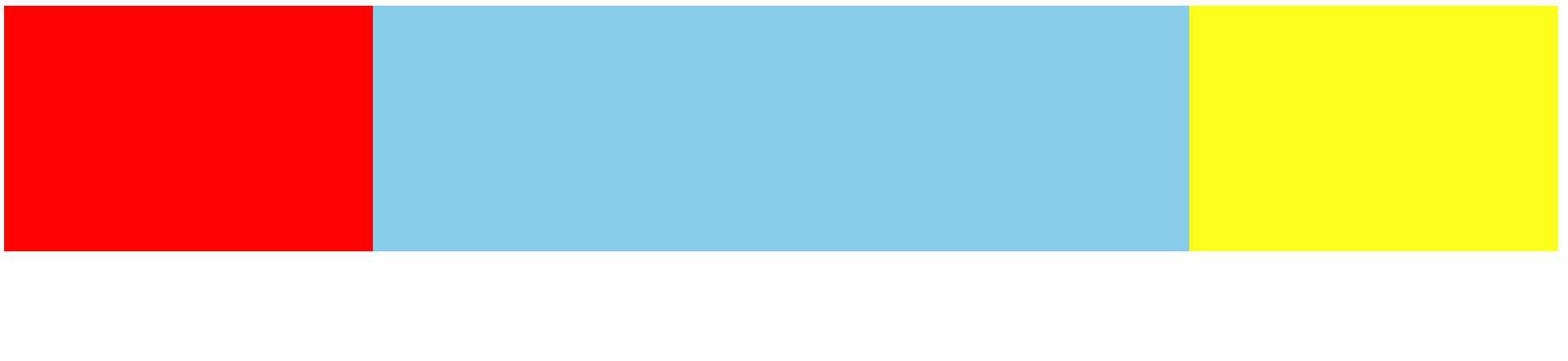
# 1、float
html 部分,center 放后面
<div class="container">
        <div class="left"></div>
        <div class="right"></div>
        <div class="center"></div>
</div>
2
3
4
5
css 部分
.container {
            height: 200px;
        }

        .left {
            float: left;
            width: 300px;
            height: 100%;
            background: red;
        }

        .right {
            float: right;
            width: 300px;
            height: 100%;
            background: yellow;
        }

        .center {
            background: skyblue;
            height: 100%;
            margin: 0 300px;
        }
2
3
4
5
6
7
8
9
10
11
12
13
14
15
16
17
18
19
20
21
22
23
# 2、position 定位
HTML 不变
css
.container {
            position: relative;
            height: 200px;
        }

        .container>div {
            position: absolute;
        }

        .left {
            left: 0;
            width: 300px;
            height: 100%;
            background: red;
        }

        .right {
            right: 0;
            width: 300px;
            height: 100%;
            background: yellow;
        }

        .center {
            background: skyblue;
            height: 100%;
            left: 300px;
            right: 300px;
        }
2
3
4
5
6
7
8
9
10
11
12
13
14
15
16
17
18
19
20
21
22
23
24
25
26
27
28
29
# 3、flex 布局
HTML center 放置中间
 <div class="container">
        <div class="left"></div>
        <div class="center"></div>
        <div class="right"></div>
 </div>
2
3
4
5
css
.container {
            display: flex;
            height: 200px;
        }

        .left {
            width: 300px;
            height: 100%;
            background: red;
        }

        .right {
            width: 300px;
            height: 100%;
            background: yellow;
        }

        .center {
            background: skyblue;
            height: 100%;
            flex: 1;
        }
2
3
4
5
6
7
8
9
10
11
12
13
14
15
16
17
18
19
20
21
22
# 4、table 布局
html 同 3
ccs
.container {
            display: table;
            width: 100%;//注意,要加上  width: 100%; center 不设置 width 将会自适应
            height: 200px;
        }
        .container>div{
            display: table-cell;
        }
        .left {
            width: 300px;
            height: 100%;
            background: red;
        }

        .right {
            width: 300px;
            height: 100%;
            background: yellow;
        }

        .center {
            background: skyblue;
            height: 100%;
        }
2
3
4
5
6
7
8
9
10
11
12
13
14
15
16
17
18
19
20
21
22
23
24
# 5、Grid 布局
网格布局 Grid第一个专门为解决布局问题而创建的CSS模块 (设置容器类型,然后设置列宽和行高,Grid 详细了解 (opens new window)
html 同 3
css
.container {
            display: grid;
            grid-template-columns:300px auto 300px;
            width: 100%;
            height: 200px;
        }
        .left {
            height: 100%;
            background: red;
        }

        .right {
            height: 100%;
            background: yellow;
        }

        .center {
            background: skyblue;
            height: 100%;
        }
2
3
4
5
6
7
8
9
10
11
12
13
14
15
16
17
18
19
20
# 方案的一些缺点
方案1 2 :float和position方案的有点是兼容性好,因为都是比较老的解决方案了, 缺点是float之后需要清除浮动造成的影响, 定位的话就是绝对定位之后脱离文档流了,你要注意用position:relative包裹一下
方案3 : flex IE 8以下不兼容
方案4 :语义化不佳
方案 5:并没有做到大部分浏览器兼容,不过以后grid是一个趋势
# 3、如何实现一个最大的正方形
利用 padding -bottom
原理:对元素的margin设置百分数时,百分数是相对于父元素的width计算,不管是margin-top/margin-bottom还是margin-left/margin-right。当然,padding的原理也是一样的。
.section{
            width: 100%;
            padding-bottom: 100%;
            background-color: cyan;
        }
2
3
4
5
# 4、画一个直角三角形
利用 border
代码 :
 div {
        width: 0;
        border: 200px solid transparent;
        border-bottom-color: cyan;
        border-right-color: cyan;
     }
2
3
4
5
6
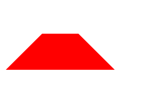
# 画一个梯形
 div{
      width: 50px;
      height: 0;
      border: 50px solid red;
      border-color:  transparent transparent red transparent ;
    }
2
3
4
5
6
# 5、画一个书签

.bookmark {
            width: 0;
            height: 200px;
            border-left: 50px solid #ccc;
            border-right: 50px solid #ccc;
            border-bottom: 40px solid transparent;
        }
2
3
4
5
6
7
# 6、如何用css实现瀑布流布局
利用 column 属性
- column-count:指定列数
- column-gap: 设置列之间的间距
<template>
  <div class="waterfall-width-column">
    <div class="image-box" v-for="img in imgList" :key="img">
      <img :src="img" alt="" />
    </div>
  </div>
</template>
<style lang="scss" scoped>
.waterfall-width-column {
  column-count: 3;
  column-gap: 10px;
  .image-box {
    img {
      display: block;
      width: 100%;
    }
  }
}
</style>
2
3
4
5
6
7
8
9
10
11
12
13
14
15
16
17
18
19
瀑布流的本质就是寻找各列高度最小的一列,并将新的元素添加到这一列的后面。只要有新的元素需要排列,就继续寻找所有列中高度最小的列,将后来元素添加到最小列上。
# 一个自适应矩形,水平垂直居中,且宽高比为 2:1
.box {
    position:absolute;
    top:0;
    right:0;
    bottom:0;
    left:0;
    margin:auto;

    width:10%;
    height:0;
    padding-top:20vw;
    background:red;
}
2
3
4
5
6
7
8
9
10
11
12
13
# CSS中flex布局最后一行左对齐
让after 伪元素占剩余空间
<div class="container">
  <div class="list"></div>
  <div class="list"></div>
  <div class="list"></div>
  <div class="list"></div>
  <div class="list"></div>
  <div class="list"></div>
  <div class="list"></div>
  <div class="list"></div>
  <div class="list"></div>
  <div class="list"></div>
  <div class="list"></div>
</div>
2
3
4
5
6
7
8
9
10
11
12
13
body {
  height: 1000px;
}
.container {
  float: left;
  border: 1px solid #000;
  display: flex;
  width: 290px;
  flex-wrap: wrap;
  justify-content: space-between;
  resize: both;
}
.list {
  width: 65px;
  height: 65px;
  margin-bottom: 10px;
  background-color: rgb(148, 148, 131);
  margin-right: 10px;
}
.list:nth-child(4n) {
  margin-right: 0px;
}
.container::after {
  content: '';
  display: block;
  flex: 1 1 auto;
}
2
3
4
5
6
7
8
9
10
11
12
13
14
15
16
17
18
19
20
21
22
23
24
25
26
27